You know where you want your business to go and have a clear strategy for the future. But having this alignment doesn’t mean you will achieve all of your goals, since technology is an integral part of being successful.
Determining what technology you should use for your company and diving into details can get a little muddy. Whether you are building a mobile application, a customer portal, an intranet or a responsive marketing Website, here are 10 universal tips on how to create a memorable user experience for the humans on the other side of that screen:
Have a clear message. People want information quickly, and their very first experiences with your technology are a key to your success. Thus, it is important to clearly communicate what your solution is about on the first page of your Website or application. The content should be easy to read and organized using bold titles, paragraphs and bullet points instead of long sentences. In today’s world of SMS, Twitter and newsreaders, people get frustrated if they have to read through tomes of text. Keep it simple.
Building for a target audience. Creating an app or Website without considering certain aspects of your target audience (like age, gender, education level, location, content preferences and others details) will reduce the overall experience for certain users. Make sure you cover all the important aspects of your target audience. In addition to understanding the basic demographics of your audience, we like to use the DISC personality-profiling model as a very basic framework for understanding your users personality style. It is also really important to think about how those demographics are trending. Essentially, the more you know about your target user, the better.
Designing with taste. Although design is an important part of a great user experience, overwhelming graphics will make the relevant information and general text content invisible to your viewers. You are much better off with subtle and simple graphics that inform the user and help them make better decisions, faster vs. trying to overwhelm them with emotion. Remember that you want them to come back to your solution over and over again. You want them to be eager to use it. Your primary goal should be to reduce the amount of time the user has to spend figuring out your user interface.
“Simplicity is the ultimate sophistication” – Leonardo da Vinci
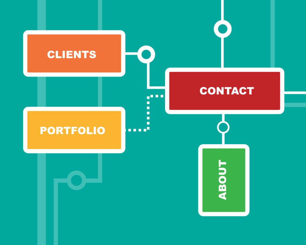
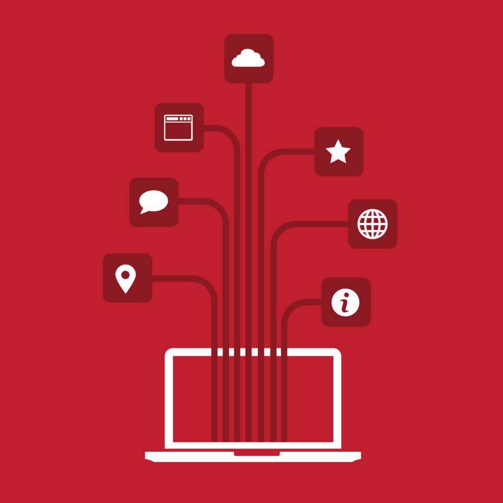
Relevant navigation menu. An over-complicated navigation that doesn’t address the most important features of the app or Website can become very frustrating. This is why you should build a navigation menu that is relevant to your customers and also let them find quickly the significant information. Information architecture is as much an art as it is a science. You should be prepared to be wrong and study your users actual behavior so that you can constantly re-prioritize your content to better serve your user.
Quality imagery. They say a picture is worth a thousand words. Having quality, brand specific images is an important aspect to consider when creating an app or Website. Having every interface be brand aligned and consistent will help build trust and earn loyalty over time. In regards to eCommerce solutions, emotions often play an important role in the purchasing process, so images that evoke a positive situation or generate an emotional impact will guide users towards making the decision to purchase. Make sure that your images represent your brand voice.
A user experience that inspires. Technology simply cannot be separated from your brand identity. The experiences your customers have with your technology are often their first impression of your company. At that moment, it is your brand. That’s why it’s so important to design useful, engaging web sites and applications while instilling the concepts of “Move, Touch and Inspire” into every technology experience you produce. Click here to see the Move, Touch and Inspire concepts.
Loading time. Everybody hates an app or Website that takes forever to load. Here are some overall techniques that will minimize the load time:
- Optimize image sizes for screens appropriately
- Use a central CSS or Javascript file to reduce the HTTP requests
- Load layout images directly into the CSS file when possible
- Compress the HTML files
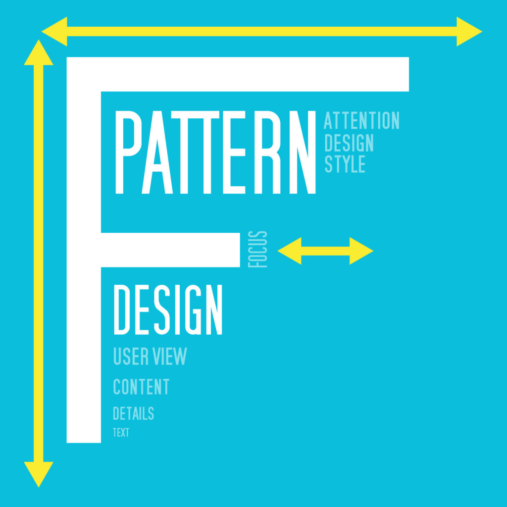
“F” pattern design. Eye tracking studies have identified that people are scanning computer screens in an “F” pattern. The sections that are in the top and left of the screen and the middle left side of the screen have the best visibility. The right side is rarely seen. Designing with this aspect in mind will make your web site or application content much easier to follow and read.
User expectations. Understanding your user’s concerns and meeting them is paramount. Iterative development lets you build in smaller increments and test your solutions with the folks that will actually use them. Make sure that you are certain that you deeply understand the concerns that you are trying to address and have a plan in place to constantly test your understanding of your user’s concerns.
“The most important consistency is consistency with user expectations.”—William Buxton

Optimizing for all screens. It is not enough to have an online presence on the desktop screens. Since mobile usage is growing each year, people are expecting a custom experience for each device. Having a full responsive experience across all platforms, from desktop to tablet and mobile is more likely to maximize your traffic and can also improve your brand visibility. In fact, most organizations should be taking a mobile-first approach to their experience design. If you look, you will most likely find that the data supports that decision in most cases.


